003: Donut Panic?
June 27, 2022
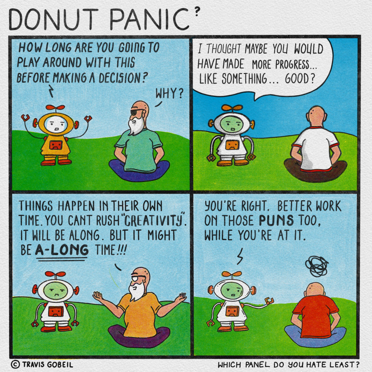
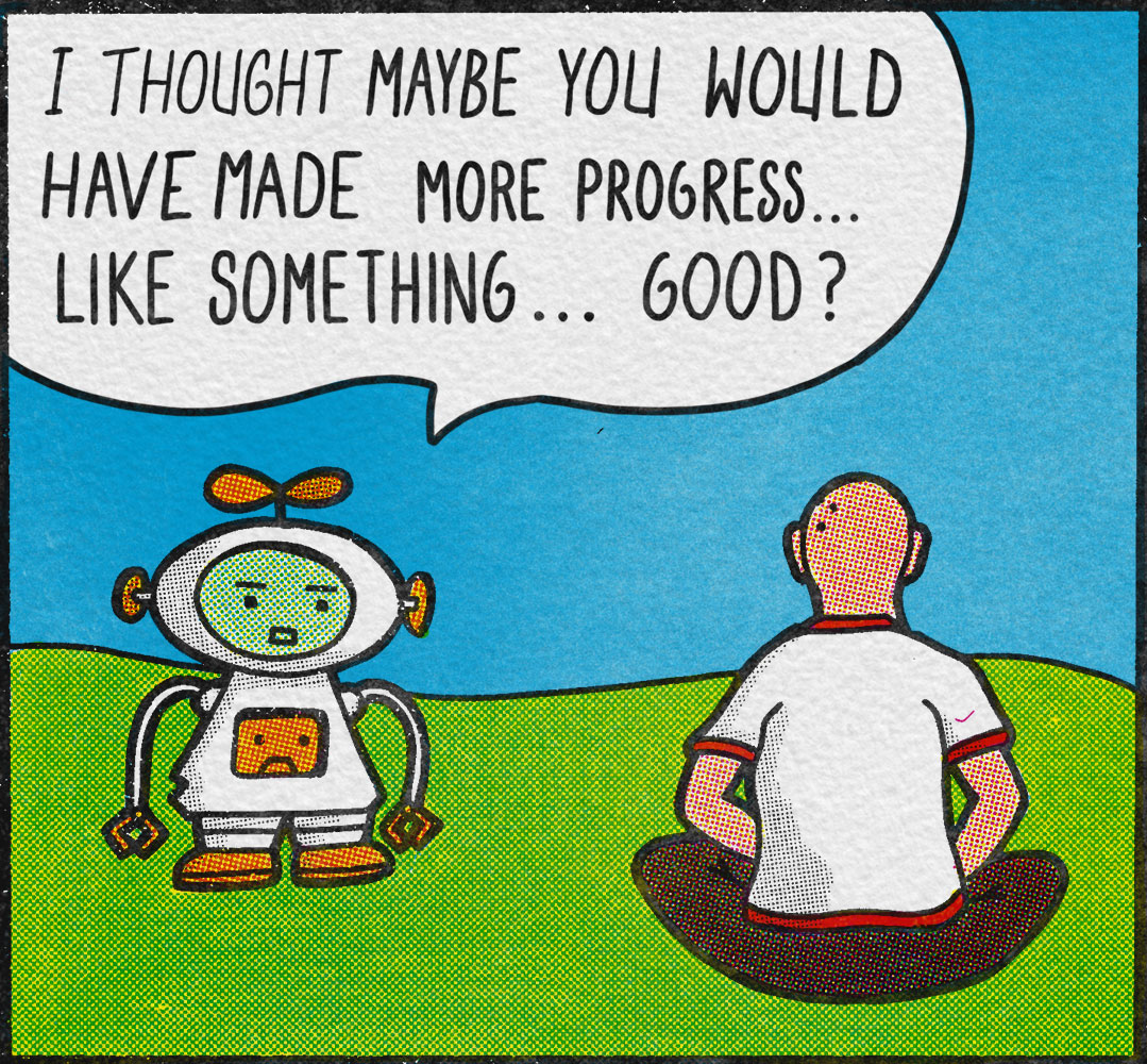
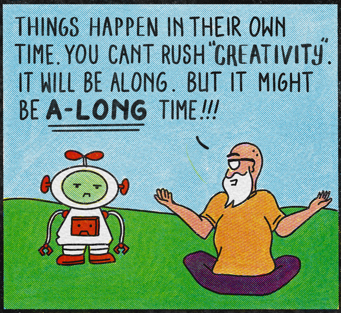
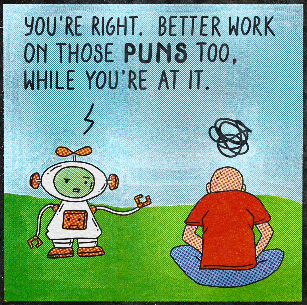
After several failed attempts (see: previous note on failure), I finally started to discover the style I felt like moving forward with. Inspired by newsprint comics that I grew up reading, I attempted to find a way to re-create that grainy, spotty, imperfect magic that was the funny pages. Digitally.
Newspaper grain is easy to fake. Ink too. But the colour? There’s just something about CMYK printing process on newsprint that I needed to at least attempt to replicate.
Your two-minute printing lesson:
In four-colour printing, you combine Cyan, Magenta, Yellow and Black by printing them on top of each other, but with something called a ‘halftone screen’ that prints shades of these four colours along special angles: 90° for yellow, 75° for magenta, 105° for cyan, and 45° for black. If you line up some tiny dots just right at these particular angles, you get the illusion of full colour.
I figured if I could make brushes with dots at certain angles, I could replicate that look and feel in Procreate. I could mix and match the colours and dot sizes to make virtually any colour I wanted! Of course the actual making of these brushes was ridiculously complicated. Thankfully, I found that True Grit Texture Supply had already made a whole kit that did exactly what I wanted! It has several brushes for each amount of dot and colour screen angle. You just build the colours up using the formulas and you can create hundreds of colours from genuine four layers of ink!
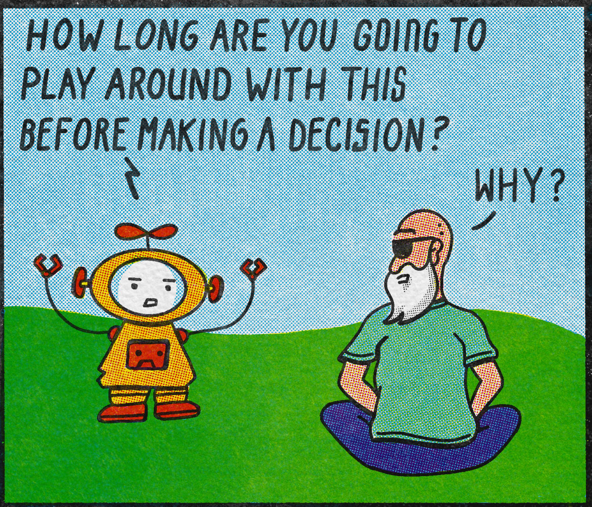
Obviously, giving me the entire colour palette was a bad idea. I also still hadn’t figured out how I was going to do lettering or inking. Since I’m still just playing around and have no intention of this being the “official look”, I gave myself permission to experiment with variations on my earlier style attempts. This resulted in four slightly different looks in each panel. You might notice the last panel is very close to what I landed on.
