
007: Sail the Trauma Seas
August 29, 2022
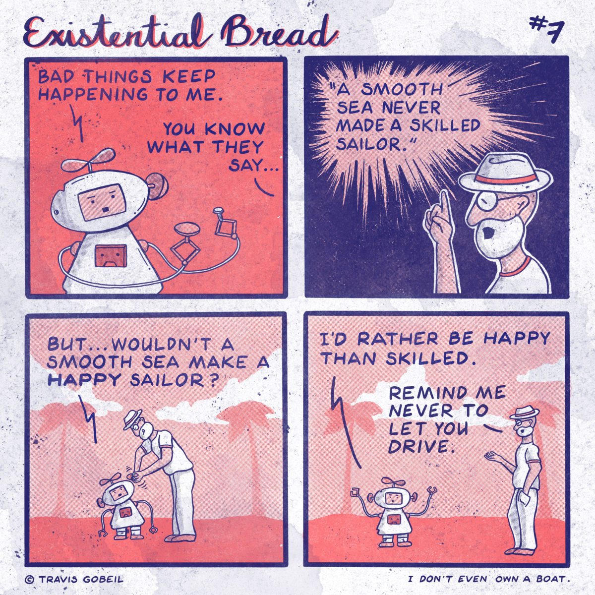
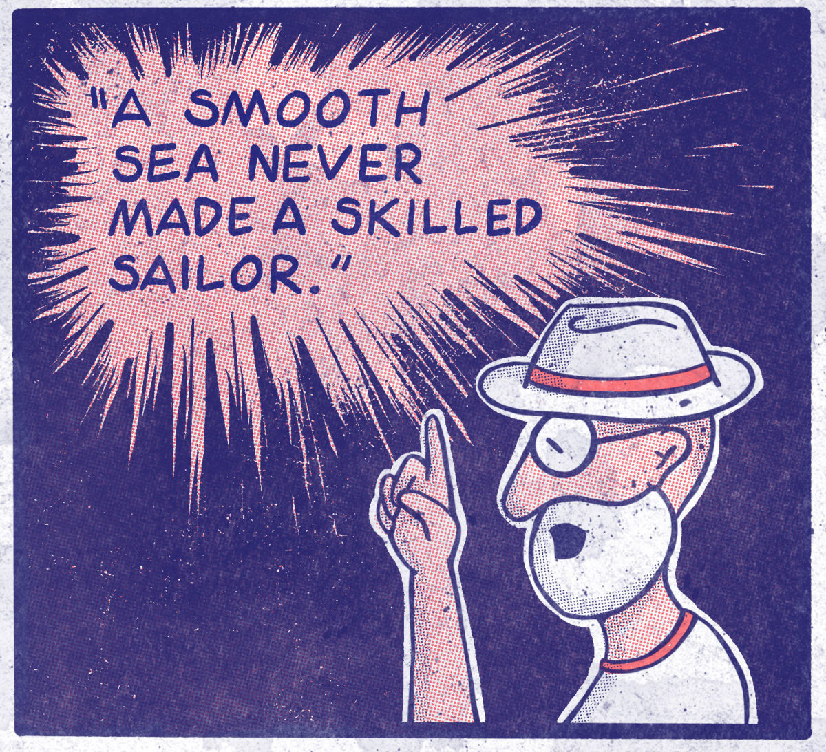
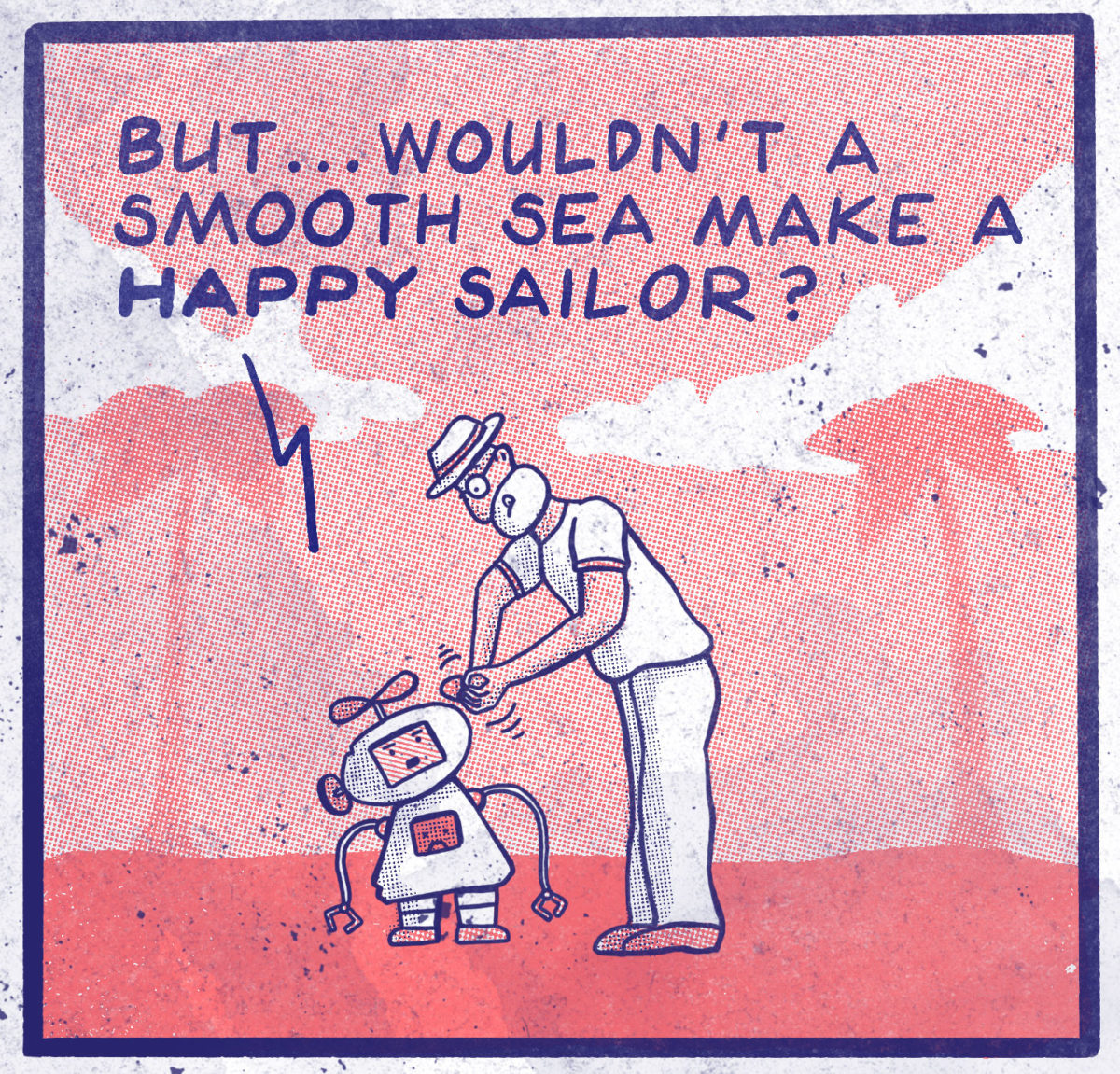
Lots of major changes here! This comic has become the ‘standard’ for what I’m going for. Writing is on point, and it’s ‘colourful’ without being full-colour. A total win! Still room for improvement.
I completely overhauled my inking style with some newly acquired Procreate Brush sets. I spent a week practicing the classic “comic book lettering” style from old-school comic books. This finally made it look closer to what I was envisioning: a sort of digital newsprint webcomic.
This also features the colours I would ultimately settle on! I have an old colouring page from my youth that I coloured with a dark blue and a salmon pink and I always thought those two colours really worked well. I wanted a “signature” colour palette to help people identify the comic, and set it apart from the bajillions of others. Anyone can use full-colour, I am going to work with just blue and pink (salmon! It’s definitely salmon!)
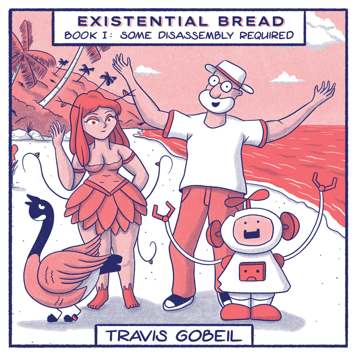
Character models were also being refined. Someone pointed out on Reddit that the old man looked very much like Master Seiyu from Dragon Ball and I just couldn’t disagree. What I changed it to (shorter beard, glasses not sunglasses, and a hat!) actually looks very much like my father, or what I’ll look like in 20-30 years. Even a setback like a character design flaw resulted in better work.
